Reading an article in the Wall Street Journal the other day, I noticed an interesting graph focusing on industry/sector performance for 2015. Obviously, if you’ve been participating in the market, Oil & Gas have been hit pretty hard along with banking and coal, but to comprehend the enormity of the U.S. economic landscape requires powerful tools and visualizations, coupled with talented analysts, or teams of analysts, that can focus on the myriad specialties here from Accident & Health Insurance to Wireless Communications (I couldn’t find a sector that begins with Z).
What occurred to me is that the specialization of the U.S. economy is not unlike the vast, complex landscape of a large IT organization.
So, do you know how many enterprise applications that average company with > 150 in IT has?  I do, thanks to our interesting IT benchmark database.  It’s about 300.  And, these are enterprise applications only, not desktop software such as Microsoft Office, Adobe Photoshop, WinZip, etc…  Further, the trend toward SaaS doesn’t necessarily eliminate this kind of complexity.  It certainly can help with the overhead of IT operations, but each enterprise application still needs to be administered, customized and updated.  In fact, some tasks are more difficult, but that is outside of the scope of this blog.  The bottom line is that each of these enterprise applications brings with it additional complexity in the form of new specialties that must be mastered with existing people or additional headcount.  And, CIOs do need to understand the performance of these staff in all of the various groups that they form, however performance is defined, in aggregate and at a granular level.
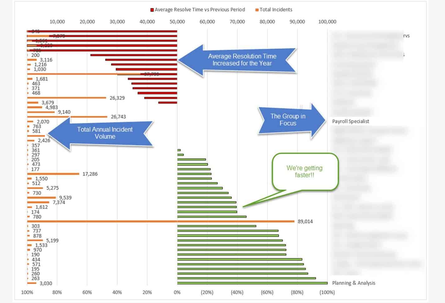
So, for discussion’s sake, we put together a sample visualization that mimicked the WSJ format, replacing annual stock performance with annual average resolution time performance (rather than sector performance), annual incident volume (to replace trade volume) and IT Group (rather than sector).  What does it look like?
IT Performance Measurement
So, as you can probably gather from the figure above:
- Red Bars indicate that the Average Resolution Time increased for the year for groups that met a certain threshold of Incident activity.
- Green Bars indicate the opposite, so these are your top annual performers in terms of resolution time improvement YoY.
- The Orange Bars indicate incident volume which shows the relative weight of the performance improvement (outside technology criticality).
Let’s open it up for discussion.  What are some of the ways you measure performance across the IT organization?