Six sigma is a pretty big topic to tackle, so I thought it might be best to handle it via a practical example using control charts. Plus, I’m an inductive thinker, so this is for those of you that like bottom-up thinking. The most common example of six sigma application is probably Pareto Analysis, but since most companies have leveraged this method to some extent already, we thought we’d cover the XmR chart with respect to critical business services. Of course, most people haven’t yet defined business services, but who wants to read the same old boring marketing material anyway? This is something you can begin to apply today.
First, we’ll start with some classical thought on the subject, then feel free to watch the video at the end. Obviously, Northcraft helps make this analysis happen more quickly through complete automation of the method, but it’s possible to perform these analyses manually.
Introduction:
The first step in breakthrough improvement is summarizing the massive
amount of data collected about Events, Incidents and Defects (failed releases potentially) in your organization. It doesn’t matter if it’s scrap in manufacturing, medication errors in healthcare or a known error in the problem management process because defects, waste and rework can easily consume a large portion of corporate budgets.
Next, we need a method to sort through the madness (data)…
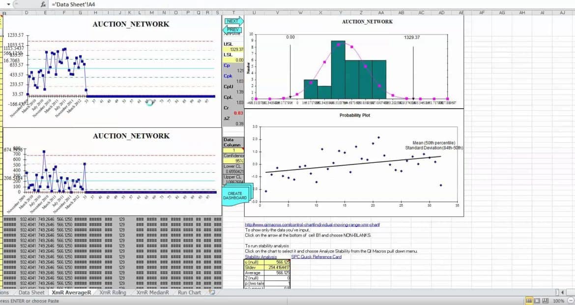
What’s a Control Chart?

Use Control Charts to measure and monitor the
performance of any process.
Without control charts, it’s difficult to sustain
improvements!
Control Charts highlight the upper and lower specification limits of a process. In IT, we have standard processes (such as a standard change) and we have ad-hoc processes (emergency change). So, control charts helps us pick off the manageable chunks for standardization. We especially need to make sure that our revenue-impacting production critical business services are standardized to a great extent, so control charts can be an effective tool here.
When do we use Control Charts? Is this the right method for me?
We must learn how to standardize for the routine, but allow for flexibility where the business demands it. Control Charts helps us to jointly define routine IT processes and monitor the stability with agreed upon terminology. This gives IT the ability to dedicate fewer resources to the mundane processes and focus our attention and limited resources on innovation when needed.
A Brief History on The Origin of Control Charts…
Control charts originated at Western Electric in the 1920s with Shewhart. For reference, you might want to get a hold of a copy of the Western Electric Statistical Quality Control Handbook (1956). Interestingly, the preface begins by saying: “This book is written in non-technical language, and no attempt has been made to write for the professional statistician or mathematician.” I personally like this, because it really does take intelligence to break down complex subjects into something readable.
The Western Electric program focused on “the control chart, and particularly the process capability study, as the foundation of the entire program.” The book “does describe certain procedures and methods which the Western Electric Company has found desirable to emphasize in order to secure the wanted results from its quality control programs.”
The authors go on to say: “Statistical Quality Control can be applied to anything that it is possible to express in the form of numbers.” Well, that’s probably a bit of hyperbole, but you know how passionate people can be when they’re experts in a topic.
So, What is Statistical Quality Control?
Western Electric summed it up this way:

So that’s it in a nutshell.
If Control Charts are right for you, then harness the power…
The Power of Control Charts
Control charts help us study our performance in ways that make it behave the way we want it to behave. If your process isn’t behaving the way you want it to, maybe it’s because you haven’t subjected it to the scrutiny of a control chart or capability study. Of course, all processes vary: “Instead of being exactly the same from point to point or from time to time, the numbers vary.”
Finally, embrace the change (variance) by defining what’s acceptable for the process… and what isn’t… for what’s important… together.
The Northcraft Analytics solution will analyze both the stability and capability
of an IT process. Here’s an example of how quickly you can build a control chart for your business services. Or, if you’d prefer, contact us for a demonstration with your data.